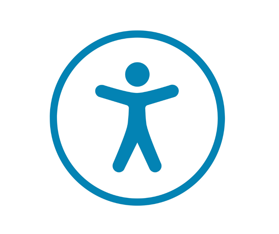
Yesterday, I posted that I created a digital Accessibility Advocate badge. In creating the badge, I struggled with the symbol or icon to use on the badge to represent “accessibility”. Today, I did a brief bit of Googling and see that I’m not alone in my struggle.
Early in my Googling, I came across an interesting history of the icons/symbols related to accessibility on Joe Clark’s website. It appears he started this page in the early 2000s and updated it over that decade ending about 10 years ago. As noted in his overview,
“After half a decade of attempts and a misapplication of the ‘classic’ wheelchair icon, we finally have something that might work as a generic indicator of accessibility – from Apple, of all places.”
He is referring to the symbol that resembles the one I used in my badge – the figure with outstretched limbs in a circle that Joe points out recalls da Vinci’s “Vitruvian Man”. As Clark notes, while the wheelchair icon is well known, the challenge is to boil the concept of “accessibility” down to a single symbol. According to Clark, Apple’s symbol is meant to signify the concept of “universal access”, but I’ve had a hard time tracking down its history.

I have a MacBook, so when I found the icon shown above on the Noun Project website within my search for an “accessibility” icon, I just assumed it was a “generic” symbol as that’s the icon used to represent the accessibility features on a Mac. However, now I want to know more. Is this really “Apple’s icon” – as in, do they hold the copyright? Is it a good symbol to represent accessibility? As noted in the critiques of the “classic” blue wheelchair, how does the symbol represent persons with disabilities? How does that symbol represent accessibility as it relates to learning (e.g., using the internet/computers, accessible resources, etc.)? What symbols/icons are others using?
As later considered in a 2013 Huffington Post article I found titled “Reimagining Accessibility and the Wheelchair Symbol” by David Onley, his history lesson of the symbol takes us through the twists and turns back to the Apple icon, but concludes with a call from the Ontario College of Art and Design University for an international competition “to find a contemporary symbol or set of symbols that will achieve the same global recognition as the International Symbol of Access.” The article ended with the Twitter hashtag #AccessSign.
Thoroughly intrigued at this point, I poked around the Twitter posts tagged with #AccessSign (most from around the time of the 2013 competition) only to come across a CBC article noting that the contest concluded with no winner! Now, I’m into this deep. Since I actually have “real” work to do today, my digging will need to end for the day, but what is the latest on the use of icons/symbols to represent accessibility?